:

:

Friday, November 19, 2010

The Bedroom (in progress)


   I've returned to a painting I started awhile ago, in the Spring, I think. It's of our bedroom, which is a continuation of the paintings I've been doing about my home. I'm really excited about this one, because of it's intimacy and emotional importance. It's the place where my daughter was conceived and born, a place of rest and refuge from the world, a place to be alone to read or pray. It has a dark, womb-like feeling and is rich in patterns and textures that are going to be challenging to paint. The original version was from the opposite end of the room, on the same canvas. Unfortunately I didn't take a picture of that painting before I painted over it, but I do have a charcoal drawing:


I didn't really like the original composition; it felt closed off and was in a really awkward spot to paint (the light was really bad too). In this one, I'm positioned by the window, so I'm painting with natural light and more elbow room. Also, this version has the space of the closet in the background, which opens up the composition, giving it a pocket of space for your eye and mind to wander to. The rug plays a much more important role, and it's going to be fun to paint all those patterns as they move across the floor. The rug has been in my wife's family for a long time...it's beautiful, and she remembers trying to find all the abstracted animals shapes in it as a child.

 I want this one to retain the 'looseness' of the drawings I've been doing. The space is really compressed and bulging as a result of trying to incorporate such a large expanse of the room, but I want the brush work to flicker and come alive. I did a charcoal study first, and worked on it in the studio, to set things down. I'll continue to work on it both in situ and in the studio because of the difficulties of painting solely in our bedroom. (My wife said our room smells like Art school...which can be good, or bad, depending on how you look at it!)

Monday, October 18, 2010

Prospect Park


Here's a series of paintings I did recently in Prospect Park. I live a block away from the park, and in my opinion, it's definitely one of the greatest things in Brooklyn. I certainly couldn't have lived here as long as I have without it, and over the years I've come to know just about every part of it. Long walks by myself, with my wife, or my kids...it's given me a head space that everyone needs, especially living in the city. I also needed a break from doing paintings of the Gowanus area; more green and less garbage and filth.

I love the light at this time of year, with the sun getting low in the sky, causing those long, crisp shadows. I was also interested in painting these meandering paths which lead your eye through the space. Kind of funny that they're punctuated by garbage cans...can't really escape the trash, can you?! They're all 12" x 18" and relatively 'quick' paintings; about 4-5 hours and usually over a couple of days, which has been a nice break from the longer, more sustained paintings I have been doing.


I have a disturbing story which goes with this last painting. While I was out working one day, I had the one of the bandshell (below) leaning against a tree behind me. As I was painting (the first one, at the top of the post), I see off in the distance 4 kids (probably in high school, about 16 years old) coming towards me on the path. I could tell right away they were trouble; just loud and goofing around, pushing each other, cursing, etc... and not in school at about 2pm. So as they come up, one gets right up in my face..."Whatcha drawin?" Most of the time, painting in public can be really annoying, this being a perfect example. Just by his question, I could tell he wasn't really interested or serious, so I just pointed ahead of me and said "That" and kept working. They pull back behind me, and I can hear them whispering and snickering, and then the kid who asked me the question, runs towards my painting leaning against the tree, and boots it like a football. They start laughing, run ahead, and I'm left kind of speechless and really pissed. "Really cool, tough guy!" I say as I pull out my phone and call 911, just to see what would happen. They keep walking, the operator asks me if it's an emergency...which upon further reflection, I realize it isn't. I explain what happened, and she asks me if I'm willing to talk to a police officer. I figured by the time they got there, the kids would have been gone, and I really just wanted to keep painting. I say "Forget it" and hang up. Luckily he kicked the painting right on the frame's edge, so nothing happened to the painting, except some dirt and leaves got stuck in the paint when it landed face down. I let it dry for a few days, and washed it out with some water. Really made me mad and shook me up....what the hell is this world coming to? Now I have to watch out for some petty thugs who will kick my paintings around while I work? Let's just say I'm looking forward to working inside again as the weather gets cold.


Thursday, October 14, 2010

"Unveiled Faces"

"White Pines": oil on linen: 10"x15": 2010

I'll have 3 paintings in this annual Fall exhibition at Redeemer Presbyterian Church's Center for Faith and Work. This will be the third time I've participated, and I'm proud to take part in this organization's Arts Ministry. I'm out of town for the opening, but if you're in the area, I hope you will check it out.

Friday, October 1, 2010

Studio interior


   Here's the completed painting of my studio that I had been working on since early summer. Between the drawing, the in-progress version, and this one, I was able chronicle the development of this painting over several months. Nothing changed too much from my initial idea to it's completion, but the sustained observation of the scene allowed me to explore the surfaces and textures of the room to the fullest.
   My favorite part to paint was the floor. Stained with random drips and splatters from various 'projects', it began to take on an abstraction of form, with floating blobs of color, very tangible in front of me, slipping back and forth on the surface plane of the floor.  This is something that I want to explore more in the future; depicting patterns as they sit on planes in space, and how they can cause one's sense of vision to become disoriented. (I'm thinking in particular of the rug in the "Parlor" painting I did over the winter.)
   I was also able to include in a few subtle references to painters whom I admire, and have had a great influence on my work. The composition is very Alberto Giacometti, with his bowling alley-type compositions (actually an anti-Giacometti, with this one culminating in the absence of a figure.) The scaffolding and grid of the painting rack also echo the mark-making structure of his paintings. And Lucien Freud's work has been a huge inspiration for me, with his paintings about the setting and function of the artist's studio, as well as, his description of the peripheral things next to his models, like soiled rags, paint stains, and floor boards. Sometimes he also includes paintings of paintings in his painting (meta-painting, I guess?), which I did by including some previous work on the studio walls, along with my portable easel and palette on the table.
   I'm pleased with the painting's sense of light. Although my studio has a mixture of fluorescent and spot lamps, and not natural light, the constancy of it while painting was reassuring. In order to get the fluorescent tubes at the top of the painting as bright as possible, I refrained from painting over the white ground (the tubes are actually the white of the gesso.) I'm looking forward to where this will lead me next...

Thursday, September 23, 2010

Elevated F/G train (finished)


   As I was writing the title of this post, I hesitated about what to call it. What's this painting of? What's it about? It's of the train track...but it's also about a tree planted in asphalt, the expanse of a parking lot, a shadow, a grid of parking spaces. It's mostly about a record of returning to a particular spot over a long period of time (about 4 months), and trying to translate what I'm seeing, in paint.
   I stopped working on this one for a few months in July and August because of a job, and then vacation, and when I returned, I noticed that they had redone the asphalt of the parking lot while I was away. The color darkened about 3 or 4 shades and completely altered the scene. Also, somebody had graffitied the large black expanse on the face of the elevated tracks. When stuff like this happens, the dialog between what's happening on the canvas and what's happening in front of me intensifies.  There are times when what I'm seeing forces the painting to change direction or to be altered in some way, usually at an unexpected but well needed time in the painting's progression.  When I returned to work on it, I also realized that I was trying to include too much. I chopped off a considerable amount of inches from all sides of the painting; cropping it in, making the compostion tighter and denser. Check out the before version here.
   Even though I was tucked away in a corner of the parking lot (Lowe's), I still had passers-by who would stop and look at what I was doing. Some of the Lowe's employees would come over on their break to sit on the benches and smoke and have coffee. I would be there painting, over-hearing their conversations, almost invisible to them. I think most of the people thought I was crazy, seeing me there day after day trying to paint a picture of a parking lot. Some people would stop by and chat, and a few would check in from time to time to see the progress. About 11am, I would smell fried chicken coming from the Food Town behind me, gradually mingling with the putrid stench from the canal.

 
    This is a new painting of the scene that was behind me while I painted the first one. It's a spot where I would walk back and view the painting from afar. I'd stand by the railing up against the canal and survey the water. I figure what's behind me is just as important as what's in front of me.  I did it over a few days, trying to return when that shadow was at exactly the same spot. I painted over top of another painting, which gives it some distracting texture that I'm not happy about (I'll have to remember to stop doing that), but I think I captured the nastiness of the canal. There's a lot happening in the canal besides garbage and toxic waste, though. I've seen small fish, crabs...even a large horseshoe crab. Nature's resilience never ceases to amaze me.

Sunday, September 5, 2010

Great Paintings from England

My last day in England, I traveled into London, to check out some great art. My first stop was the National Gallery, which houses an enormous collection of great paintings. I had been there over a decade ago, in my early twenties, and it had made an enormous impression on me. I spent about 2 hours there, and saw a lot of paintings (too much, actually!) Here are some of my favorites:

 The Toilet of Venus, 1647-51
Diego Velazquez

This was one of the first paintings I saw that day, as it was in the main gallery as you come up the central staircase. The only surviving female nude by Velazquez, it was made for a private patron, probably the son of the First Minister of Spain. Something like this would probably not be looked upon with the Church's approval during the Inquisition; and for good reason, it's an extremely sexy painting. Depicting Venus, the goddess of love, and her son, Cupid, her form radiates from across the room. Her flesh is painted so beautifully; kind of glows from the inside, with alabaster-like highlights on her hips, legs, and shoulder. I love the way the soft curvature of her body sits on the crinkley blue drapery; each of the forms mimicing, yet complimenting, the other. Your eye passes over the profile of her face, to where she's looking, which is into the mirror that Cupid is holding. Velazquez was such a master at using mirrors and framing devices inside his painting, (Las Meninas, being the best example), which gives the painting an added spatial and narrative dimension. Her face is not painted as clearly or as descriptively as the rest of the painting. The mirror has a smokey quality to it, which hides her features somewhat, and adds to the sense of mystery. Also, she's not really looking at herself in the mirror, but over her shoulder at the viewer/painter.....amazing.


The Four Elements: Fire,1560-1574
Joachim Beuckelaer

Done by a 16th century Dutch artist, who I hadn't heard of before, this painting was in room with the 3 other companion pieces (the other elements, Earth, Air, Water). This painting is huge, about 5 x 7 feet, and is just so over the top. The first thing that caught my eye, was the way he depicted the space. He created these receding spaces in the back, through both the doors, with the middle-ground floor tilting forward. The figures and still-life elements in the foreground, flatten out and seem like they are going to slide right off onto you.  He also has Jesus in the back room, depicting the story of Mary and Martha, while in the kitchen, the servants are trying to keep the fire going and the cooks preparing the meal. The whole painting seemed very humorous to me and over-stuffed (no pun intended). The clarity and precision with which the still-life elements were painted is just beautiful....a great fusion of the physical and spiritual world.

The Arnolfini Portrait, 1434
Jan van Eyck

Amazing painting! I love the inscription over the mirror on the back wall: "Van Eyck was here in 1434"....a witty trompe l'oeil 15th century 'tag'. The sense of diffused light and the minute details are awesome...I wanted to jump over the rope partition and stick my nose right up to the painting to check out what's happening in the curved mirror on the back wall. (there are 2 figures there; one supposedly could be the artist) The brass chandelier hanging between the figures is stunning...everything is perfectly calibrated and exists in a perfect state of timelessness.

A Wall in Naples
Thomas Jones, 1782

Never heard of this artist either, but was Welsh, and a very early plein-air style painting. At this point in time, most oil paintings were done in the studio, and if work was done 'in the field', it was usually in a drawing media to support a more finished and larger piece. It's a small painting, about 4 x 6 inches, and depicts some drying laundry outside a window. A very simple and humble painting...the quickness and efficiency of the paint handling is perfect.

A Woman bathing in a Stream, 1654
Rembrandt

So many great Rembrandt's at the National Gallery. This one was in the same room as the Tripp portraits and a stunning self-portrait. Painting doesn't get much better than late Rembrandt, and this one highlights his bravura brush work and emotional intimacy. The woman is most likely Hendrickje Stoffels, who lived in his house and became his common-law wife. It's a touching portrait and catches her in a playful, private moment. His paint handling is jaw-dropping, and you can tell that the dress and her hands were probably done in one shot, with a loaded brush, wet into wet. Her legs, the reflections in the water, and the background, just dissolve into these abstract patterns and forms....damn!

Bathers at La Grenouillere, 1869
Claude Monet

Sometimes it's easy to lose sight of just how revolutionary and different the Impressionist stuff was at the time. We're sort of over run with their work now; most find it fluffy eye-candy, and it doesn't help when the work is plastered all over everything from coffee mugs to umbrellas. But coming into the room of early Impressionist work, you realize how much these guys turned the lights on in Painting with their color and paint handling. The Monet's, and this one in particular, just jump off the walls. This was probably done as a quick sketch, for a larger version to be done in the studio, but the loose paint handling and sense of light is amazing. Looking at the treatment of the water, you can see why the Ab Ex painters were particularly drawn to Monet's work. (The bottom right hand corner made me think of Joan Mitchell, in particular)

Atlantic Storm, 1876
John Singer Sargent

Not at the National Gallery, but the Royal Academy nearby, there was a Sargent show of seascapes. I'm a big fan of his work, and was really excited to see this show up. (The image of this painting was all over London and used as the promotional poster) It was a small show, covering mostly early works, with the sea as a theme. This painting was one of my favorites, and was probably done in the studio from either drawings or memory. He apparently went through a major storm on a trans-Atlantic trip, and recorded it in this wonderful, dark and brooding piece. The paint handling is loose and simple; he seems to be after the atmosphere and 'feeling' of the scene, rather than visual details and facts. I love the life raft in the lower right corner, painted really quick and hazy, and how he orients your view point, so that you're looking down the deck of the ship towards the back, as the boat's tilting up and out of the water. I almost felt seasick just looking at this painting....
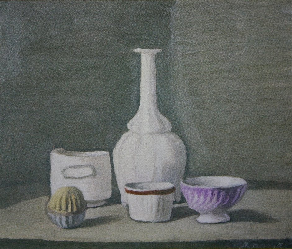
 Still Life, 1946
Giorgio Morandi

Ah...Morandi. This was at the Tate in St. Ives. I always love seeing Morandi; he's always painting more than just bottles. Every brushstroke quivers with life, and his palette and sense of light have a quality that seems to have been frozen in time.  The surfaces of his paintings feel as if they've been laid out on the beach in the sun and sand for like a hundred years; almost like what happens to a piece of glass when it's thrown into the ocean. The retrospective of his work at the Metropolitan Museum in New York a few years ago made a big impression on me.

I love that feeling I get after looking at great paintings like this...totally recharged and ready to get back to work. My goal when I get back to the studio, is to finish off the paintings I started this summer and dive into some new work that I have swimming around in my head. (and check out some upcoming shows in NYC)


Saturday, September 4, 2010

Sketchbook from England

I just got back from a two week trip to England, where my brother-in-law and his family live. We spent one week with them, outside of London, and one week in Cornwall, on a working farm. Here are some images I made in my sketchbook from our time in Cornwall:


This one's a watercolor, which is a medium I use from time to time. I have mixed feelings about working in watercolor. I find it very intriguing, and like the look and feel of it, but it's hard as hell and almost the anti-thesis of oil paint. The working methods are completely different, forcing you to employ the white of the paper as your light, and is obviously transparent and fluid, versus the opacity and density of oil paint. The thing I like about it, is how marks can be made 'unguided', that is, by letting the paint bleed into the wetness of the paper. There is a certain loss of control to this that can yield some great results. I love looking at the great watercolors of Turner, Sargent, and Homer, which have a Zen-like immediacy to them.


This one was done overlooking a pasture at dusk. The clouds were blocking the sun from time to time, giving me a small window of time to look at the scene without being totally blinded by the setting sun. The cattle were wandering to and fro, dotting the vast expanses of green fields with their presence. Looking at these now, I realize how much I need to hold on to that sense of immediacy with the paint. At times, my oil paintings can 'tighten up': I need to retain that freshness and 'roving eye' that these sketches and pencil drawings have.


Here's a couple of pencil drawings depicting the view in back of our cottage. (Sorry about the quality of the photos, the drawings are quite light and hard to photograph.)


This last drawing was done at Whitesand beach, along the southern coast of Cornwall. There's some amazing rock formations along this stretch, with dramatic cliffs, caves, and tide pools. It reminded me of the Maine coast, as well as, Big Sur in California and the Oregon coast. It's the kind of place I could paint for the rest of my life and never get bored. Cornwall has some stunning landscapes, and I can see why artists have flocked there over the years. When I went to St. Ives, I visited the Tate, which has a wonderful location overlooking the beach. I saw some great work there, and enjoyed learning about the history of the area. It was a real haven for nature-based abstraction during the post war era, and I got to familiarize myself with the artists who lived and worked there. In my next post, I'm going to focus on some of the treasures I found at the National Gallery in London....cheers!

For more photos and commentary, check out my wife's blog entries about England!

Thursday, August 12, 2010

Asheville, NC

I just got back from a week vacationing in Asheville, NC. My wife's aunt maintains a farm and runs a vacation rental on the property that her father bought over forty years ago. It's located on a wooded hill, with mountain views, and is inhabited by cows, chickens, numerous butterflies, toadstools, blueberry bushes, and a host of other natural wonders.

I brought 3 small canvases to work on while I was there. I had done a few paintings of the farm in the past, so I knew the landscape and the beauty that was waiting for me. The thing that amazed me the most this time, was the way a fog, or blueish mist, would settle in the valley around dawn and dusk. I'm not sure if this was due to the time of year, but it created a beautiful sense of mystery and atmosphere around me...a certain kind of enclosure to the sweeping expanses of space, almost like viewing everything through cloudy water.


This first painting depicts the hay loft about half way up the road to the house. I did a small drawing first in my sketchbook, and then used that to transfer the image to a small canvas that night. I liked how the forms of the baled hay were sitting in this dark cavernous space, with the one in the foreground catching a little light. It reminded me of a Rembrandt portrait; the craggy wrinkled brow and nose of someone emerging out of the darkness. The cows were grazing the pasture in the background, so I managed to sketch a few of them in quickly as they went by.


The second one depicts the pine forest which has been cultivated for lumber. I spent 2 consecutive days on this, working just after dawn, from about 7-9 am. The forest had that heavy mist settled in it, dramatizing the effect of it's depth and density. This spot caught my eye while I was hiking with my son the day before. We came upon this hollowed out space in the woods, with trees in different stages of being processed. There were piles of logs in one spot, rough cut boards in another, then mounds of wood chips, and a bright orange pile of finely cut saw dust in another. I was reminded of the similarity between how the trees were being cultivated and the vegetables being grown on the property. Things were being picked, washed, diced, cooked and eaten every night in the same way the trees were being grown (slowly, since I found out later that the white pine forest was planted by Grandpa Peterson in the 1960s), trimmed, cut, planed, and used to build structures on the farm or sold to local contractors. I had a general feeling of unity to everything that was happening on the farm; that the land was being cultivated and used, with minimal waste. It's such a blessing that my wife and her family have been able to be a part of this land over the years, seeing it grow and change, and now watching the next generation be a part of the memories that it holds.


The last one I painted was of the small pond at the front of the property. We spent alot of time there swimming and relaxing, and me, trying to catch an elusive large bass. I also painted this one just after dawn, before the sun had peaked over the ridge in the east. I liked this point of view that showed off the kidney shape of the pond, and how the reflections broke up the murkiness of the water.

I worked on all of these a little bit back in my studio today, either from the drawings I had done or memory. There's something about the immediacy of the marks and the intimate scale (10"x 15") of these that I enjoy...like a small tablet that can be held in my hands reminding me of our time there.

click here to see my wife's blog about the farm with some stunning photographs and commentary. Enjoy!

Tuesday, July 27, 2010

Studio (in progress)


Here's a photograph of the night painting I've been working on in the studio: it depicts a large painting rack, a chair, some tools and miscellaneous things. The rack contains most of the paintings that my wife and I have done, and once I finish this painting, I plan to sift through everything to see what's there. This rack contains years of paintings; some good, some bad, but all of them important. We both used to work extremely large, which I enjoy, but there's always that ever persistent storage issue lurking in the background.

I'm happy with the sense of light in the painting...I have no natural light in my studio, so it's an interesting change for me to paint indoors under fluorescents and lamps. The space is starting to develop, and it's been satisfying to explore all those shadowy crevices. I'm still not sure about the table on the right...it seems to be torquing in a strange way that doesn't seem quite 'correct'. I might experiment with removing it, and seeing how the composition works without it. I'll be away for most of August, so when I return, I can see this one with fresh eyes...

Friday, July 16, 2010

The Backyard (finished)


I finally finished up this painting last week (click here to see original post). I had started it in the spring, and worked on it over about 4 or 5, 3-hour sessions. The hydrangea flowers were painted at just the right time, in mid June, when they were really bright and crisp. I got it about 80% there, and finished the rest of it from memory in the studio. (The heat, mosquitoes and general change in the colors prevented me from finishing it up on site). It's usually a good idea to do anyway (painting away from the motif); it sort of frees you up and allows you to see the picture as it really is.

Friday, July 9, 2010

Elevated F/G Track (mid summer)


     Here's an updated photo of one of the paintings I've been working on this summer. I wrote an entry on this one awhile back, and since I'll be taking an unexpected break from working on it, decided to photograph it and post. I'll be working on a Richard Haas mural through July, and then it's vacation in Asheville, NC and England for August. (Summer's going quick!)
     It's always interesting to look at photos of my paintings...it sort of condenses the piece, giving me fresh eyes to look at it. I feel like I'm starting to make some advances with it. The light that I'm seeing is translating, and I'm starting to hammer out the space in the painting. Each painting session, I start with the lone tree right in the center of my vision, and work out from there. It's the anchor of the entire painting really, creating this nice perpendicular structure as the focal point. I also like how it's visually sandwiched between the architectural structures of the track supports in the background...an organic growth sprouting from a sea of concrete and stone.
    The space has been tough to get right; alot of shifting things around, tweaking the structures, bending things here and there. The fact that the cars constantly move has been tricky, too. There's been alot of adding and subtracting going on with these players in my visual field. The cars have to be painted quickly...sometimes I'm not able to "finish" them, but I think it gives the composition a sense of fluidity and honesty to the scene. (like watching large pieces on a chess board move around in the space). One sitting my view will be blocked, the next, the veil is lifted and I'm able to see something behind it that the painting needs.
   There are these really subtle things happening with the asphalt in the foreground, too. If it has rained the night before, I can see small seepages of water coming through the cracks, causing the color to darken and appear more violet. Sometimes there will be tire marks from trucks as they go by, altering the patterns on the grey field before me. I'm sad to stop this one for awhile, being that I'm just gaining momentum, but sometimes a break can be good....I'm looking forward to seeing it anew when I return. I'll continue to work on some night paintings through the summer, and hopefully finish this one up in September.

Friday, July 2, 2010

Color


     I recently started using an old palette of mine in the studio, so I thought it would be an apt time to write a blog entry about my color. I began using this palette during in my undergraduate days at Syracuse University, when I was just starting to seriously pursue oil painting. That was about 18 years ago, and it is now layered with many pages of painted history. The paint got so thick in some areas, that I had to scrape it down to find a level surface again.
   
     I like to mix my paints on wood, not only because it provides a middle-value background tone to mix on, but after many wipe-downs of paint, the pigment and linseed oil give it a durable stone-like feel; not too slick, not too absorbent.

My colors are laid out from left to right in the following way:

Titanium White
Yellow Ochre Pale
Cadmium Lemon Yellow
Cadmium Red
Alizarin Crimson
Burnt Sienna
Viridian
Cobalt Blue
Ultramarine Blue Deep
Ivory Black
Raw Umber
Burnt Umber

     Initially, I started out using just the first nine, and later added the black, raw umber, and burnt umber. I was always told never to use black in color mixing, but like most rules, they can be broken if you have the acquired wisdom. I usually use the black in the beginning stages of the painting, to draw out the forms with a thin liner brush. It can be added to certain darker colors such as the browns and blues, but never with something like a cadmium yellow or white. I also found the umbers to be good 'weak' colors, ones which you can add to a tone to knock it down a bit (the burnt umber being a little redder, the raw umber a little greener). I've tried various other colors through the years, but find I can usually mix them using this basic palette.

     As for brands, I go with the highest grade paints (Windsor and Newton, Old Holland, Blockx, and Schminke) There's truth to the phrase "You get what you pay for". The Cadmiums and Cobalts in these high grade paints are beyond comparison; there's just more pigment content and better fluidity which can't be achieved in a low-grade paint. For certain colors I use certain brands, but I'm usually somewhat flexible, depending on what they have at the store. The Old Holland Lemon Yellow is the best I've found, as is, the Blockx Cobalt Blue and Burnt Sienna.

     For a medium, I use a mixture of 25% Poppy Oil and 75% English distilled turpentine. I used to use a higher oil content, but lowered it because I wanted the paints to dry quicker and have less sheen. The poppy oil is clearer than linseed oil, which tends to be sightly yellowish, and I've found it to dry a little quicker too. Like the paints, I find it best to use a high-quality, refined product, like Old Holland or Windsor and Newton.

     I'm usually mixing my colors with a brush, which allows me the fast reaction time I need when painting from observation. This usually destroys my brushes quicker, so I tend to buy less expensive brushes for this reason. I recently started using more synthetic sable brushes, which allows for a smoother application and less 'drag', but I also like a bristle brush, which can give you a chunkier mark.

     My education in color came mostly from a fellow student while I was an undergraduate at Syracuse University, Ignacio Valdez. He was from Spain and about five years older than me, and light years ahead of anyone in the program. (At the age of 25, he was able to paint the air between objects!) This guy knew so much about painting, and particularly Cezanne, whom he considered one of the greatest painters to ever live (which I would agree with). I spent countless nights listening to him talk about Cezanne's color use and compositional devices, describing his warm/cool color choices and the way he created a truely modern art form through the investigation a perceptual space. He taught me that the most important color you can have is Burnt Sienna, because it can make a cool color warmer and a warm color cooler (since it contains some blue). Mostly, he introduced me to Cezanne, who I have never gotten over, and return continually to study and absorb his work.

     My color sense was also sharped while working for a hand-painted wallpaper company in Manhattan, my first 'art' job upon arriving in New York at 22. I spent about a year hand mixing all the paint for their wallpaper production, sometimes laboring over a single gallon for 3 days, to get the color match just right. All their paper was made to order, so my job was to mix the paint to match the swatches they had in their master book. I could get pretty close by 'eye-balling it'; dropping various tints into the bucket and then mixing it together with a mixing bit on a power drill. Then the tedious part started; putting a drop or 2 of tint in, mixing it up, making a swatch, letting it dry, checking it against the master swatch, repeating until it was exact. This provided me with the best practical paint training I could have ever hoped for. It was, as you can imagine extremely boring and tedious, but when I turned to my own painting in the studio, I was abe to quickly de-construct the colors I saw and needed. It's left me with this uncanny ability to figure out a color mix quickly
and easily, and also not to be afraid of using large quantities of paint...easier to do when someone else is paying for the materials.

Saturday, June 26, 2010

Study for "Studio Interior"


I recently did this study for a new painting. It's charcoal on paper, 32" x 22.75". I felt like I needed a painting to work on inside, something that wasn't so dependent on the weather, like the other paintings I'm doing this summer. There's something about the stability of working on this one that I like; every time I go to the studio, everything's exactly the same as it was the last time. I've marked the position of some of the things I'm painting, like my shoes, the table saw, and the chair to make sure of this. My original idea was to do a self-portrait, something I haven't done in awhile, with the interior of the studio as a background element. In fact, I had thought of placing a mirror directly behind the chair in the center of the composition. The more I thought about it, the more I felt like it would have been too straight forward and literal. I like the fact that it functions as a self portrait without depicting my image. The accumulation of my paintings (along with my wife's) on the large painting rack, as well as, the tools and clothing, all contain elements of myself. The empty chair acts like a receptacle for all these things and the ideas that swim around in the studio of an artist. There was something very direct and obvious about drawing this corner of my studio...the center of the drawing even lines up with the intersection of the wooden support of the rack, almost functioning like a scope for the whole scene. It's strange to paint under artificial light after working outside so much, something I find challenging yet oddly soothing...plus I get to listen to music while I work, which I enjoy very much. Stay tuned for the completed painting...

Wednesday, May 26, 2010

The Backyard (in progress)


So I've got a few paintings going this summer: the elevated F/G train, a small interior painting of our bedroom, and this one of our backyard. I'm thinking of starting a large studio/self-portrait painting too, which would give me another option to paint if the weather isn't good. Spring's a tough time to paint...the weather's unpredictable (alot of rain) but the colors are so crisp and vibrant, especially the green leaves that have just burst forth. Over the past year, I've done a number of paintings of our house. One reason, is that I know this space so intimately, having renovated and lived in it for 6 years now. Another, is that we will be moving eventually, and I feel that by doing these paintings it is offering me documentation and closure on such an important part of my life.

Most of these paintings are pictures of ordinary moments; the plant in the corner of the kitchen, the parlor after the kids have gone to bed, my wife lying in our bed before sleep, the backyard as I glanced up to look at the deck. They represent a quietness and introspection that develops with a space over time. I also enjoy investigating these small enclosures of space, rather than landscapes with a seemingly infinite horizon or canopy of sky.

The backyard painting is almost square (24" x 23"), which is not a size I normally work in. I like the centrality of the composition: straight, dead-on, looking at the back of our house with an elevated deck. The pathway to the stairs is flanked by a profusion of greenery, which was lovingly planted and tended to by my wife. After 6 years, it has flourished with an unbelievable lushness and density, and it's hard to believe that it was all concrete when we moved in. When I first started the painting, I loved the way the light bleached out the back wall bright white in the afternoon sun, but found the light coming through the trees difficult to paint. On an overcast day, I can see the forms better; I've yet to reconcile which light I want to paint it in. The hydrangeas will be blooming soon, so I definitely want to add those colors (violet, blue) as well. Our backyard gets so overrun with mosquitoes by mid-summer, that I'm nervous it's going to be unbearable to work back there soon. It's been such a peaceful place to paint, a small oasis of greenery in this city of stone and metal. I enjoy the squirrels scurrying around on the trees overhead, the birds chirping and hearing the church bells ring on the hour. There are times when I just dissolve into the present moment; that what my hand/eye/mind are doing blends perfectly and there is just the pure experience of seeing.

Monday, May 3, 2010

Brooklyn Light


I have 8 paintings in this exhibition, with an opening reception this Friday, May 7th, from 5:30-8:00p. The exhibit will also be open Saturday and Sunday May 8, 9 and May 15, 16 from 1:00-4:00pm. Some older paintings of mine, some newer ones...all focusing on the light of Brooklyn. My work is paired with Megan Prince's gestural abstractions, and the venue is a new modernist home, Solis, in Fort Greene (174 Clermont Avenue).
Here's the press release:

“Brooklyn Light”

“The history of architecture is the struggle for light.”
Le Corbusier

“Ideas are to literature what light is to painting.”
Paul Bourget

Light, so ubiquitous and fundamental, we often take it for granted. This exhibit explores and celebrates light from a Brooklyn perspective, both in the venue – a newly-constructed modernist home in Fort Greene designed to maximize natural light – and in paintings by two Brooklyn artists: impressionistic cityscapes and abstract compositions.

Francis Sills

“My Brooklyn cityscapes are done ‘en plein air’ and deal with the intricacies and challenges of working from observation. Being in front of the motif allows me to fully explore the world around me and, through intense visual scrutiny, gives my paintings the density and specificity of an observed experience. While working outside, the weather becomes a partner in the creation of the work itself and requires me to capture and respond to the effects of the changing light and atmosphere. These paintings were all done around my studio in Gowanus, Brooklyn’s rapidly changing, post-industrial landscape. The stark forms of the buildings and the grittiness of the surfaces, reveal hidden gems of light, color and pattern. By finding inspiration in the decaying structures, with their worn-out and muted colors, not only am I documenting the area, but working towards its renewal, finding beauty and elegance in a place most people tend to avoid.”

Francis Sills’s work has been included in exhibitions both nationally and internationally, and is in numerous private collections. He received a Bachelor of Fine Arts degree from Syracuse University in 1996 and a Master of Fine Arts degree from Parsons School of Design in 2001. He currently lives in Windsor Terrace with his wife, Faith, and their 2 children. More information and images an be found at www.francissills.com.

Megan Prince

“My paintings, much like how I think of Brooklyn, are the culmination of many moments suspended in time reflected to us by each new day’s light. These slow paintings with fast moments are about process and history, and are layered with the scars of applied and removed marks. Washes of color are pushed and scrubbed into a thick oil ground where organization turns constantly into chaos, which cries for simplification. Reduced to a single stoic or hazy image or even a few lone marks, these thinly-painted canvases use space, light and movement to signify time past and point to the future.”

Megan Prince, a prolific mixed media artist, has been awarded several grants and fellowships, and is currently a studio fellow with the Elizabeth Foundation for the Arts in Manhattan. Megan, a Seattle native, has two BFAs from the University of Washington and moved from Seattle to New York City to obtain her MFA at Brooklyn College. Her work has been included in numerous shows and also exhibited at public institutions. More information and images can be found at www.megprince.com.

Monday, April 26, 2010

Elevated F/G Track in progress


I started a new painting recently which depicts the elevated F/G train as it passes above the Gowanus Canal, and right over my studio building. The painting is quite large for doing on site, about 21" x 37". I've been drawn to doing larger pieces lately, partly because my subject matter is dictating it to me, and partly because I enjoy painting on a 'bodily' scale. The train track looms large over a long expanse of space, bridging the 2 neighborhoods of Carroll Gardens and Park Slope. The canal lies in this low point, prone to flooding, which I guess necessitated the need to create an elevated train line, instead of being dug underground. From inside my studio, I can occasionally hear the low rumble of the train above me, and always wonder which was there first, the building or the train tracks.


My first study was the drawing above, which I did in the late fall. I was initially attracted to painting the black mesh which covers the entire structure. It's such a striking piece of art in itself, reminding me of a Christo and Jeanne Claude sculpture. Talking to an MTA engineer one day while painting, he told me the mesh catches all the cement that periodically falls off the supporting beams as the trains vibrate the tracks. It's gradually beginning to fray and rip in areas, flapping in the wind like a defiant, battle-scarred pirate flag. I'm intrigued by the range of tones in the black as the light drenches it; one of those gritty, muted colors that I like to paint.

I knew I wanted to paint as much of the track as possible, causing me to compress a large angle of vision onto the canvas. I picked a spot where I could get this view in, which is located on the far side of the Lowe's parking lot. This spot is in a low traffic area, with the sun behind me from around 12-5, giving me ample time to paint. I have a fairly large umbrella to position behind me, which helps to diffuse the direct light and protect my skin from getting scorched.


This drawing was the second one I did, and worked on it over a few consecutive days. Where as the first drawing was done to stand on it's own, being denser and more active, this one I'm using as a way to gather information, developing the position of objects and lines of sight; a map for the painting to come. Because the bottom half of the painting depicts a large expanse of the parking lot, there is going to be a constantly changing field of parked cars, shifting during each painting session. I'm looking forward to how this will influence the process and end result of the painting; how the different objects will be painted in this relationship of stasis and flux.


Next up was this small oil sketch, done over 2 days, from about 2-4pm. I captured the light that I wanted, and plan to depict a cloudless day in the final painting. From this and the drawings I can transfer all the information to the larger canvas. Not only does this save me time, by building up a 'bed' to paint on before I go outside, but the process of doing multiple studies forces me to draw and re-draw the same scene, preparing me for the scrutiny that's ahead. Let's hope this summer's not too humid and the mosquitoes not too deadly...this one might take awhile.

Thursday, April 15, 2010

Kentile Floors


The 'Kentile Floors' sign is like the Eiffel Tower of Gowanus, Brooklyn. Located directly across from my studio, and visible from the elevated F and G train which passes overhead, it is a structure of instant familiarity to many commuters. The building on which it is perched no longer makes flooring (it now makes garments), but it is a mysterious reminder of the area's long history of manufacturing. The letters actually contain tubular light bulbs, which I assume worked at one point (what an awesome sight that would be!), and depending on the angle of the sun, glow with a crimson intensity. I've done a few paintings of the sign before, and thought I'd return to a familiar subject to paint over the winter months. I started this one in early December, once it got too cold to paint outside. However, I found that I still had to layer up and paint with my fingerless gloves on, due to the drafty nature of the studio building. I picked a spot near one of the hallway windows and knew I wanted to capture the sign as it towered above the skyline, all aglow with oranges and reds contrasting with the cold blue of a winter sky.


I started off doing a small oil sketch (12" x 16") with the light I wanted. I painted this in a few hours over 2 consecutive days, from about 10am to 12pm. In the study, I had captured this great swell of clouds behind the sign, which unfortunately didn't make it into the final painting. I find the sky the most difficult part of a landscape to paint. Not only is it the most transient element, especially if clouds are rolling through, but also because there is a unique and seamless quality to the atmosphere; a very particular field under which things are being played out. Painting a sky is so subtle; it's not just blue and white, but also contains reds and yellows. New York has the added element of that smog layer too, which broadens the color range considerably.

After the oil sketch, I realized there were things happening outside the picture frame which I wanted to include in the larger version. As I stood in front of the window, I found myself leaning to the left and watching the way the street curved away and up the street. There were a few open loading dock doors, as well as, a street light which caught my interest. I was also peering downward, looking over the window ledge at the street below. I had picked a difficult spot to paint from, since I couldn't step back from the painting (I was literally backed into a corner), but wanted to include these different extensions in space. I preceded to work on a large charcoal drawing from the same spot, investigating the way I was going to try to bend this space to include these different elements. In the drawing I added more paper to the bottom edge, in order to include the slow curve of the painted lines on the road. I liked the way the space was curving around the focal point of the sign, slowly sweeping around and up the street. While doing the drawing, I also got a chance to quickly sketch in a plane on it's flight path to Laguardia; a counter point to the static nature of the sign.


So from the drawing, I determined the size of the canvas, which was slightly larger. I transferred the drawing and blocked the colors in using the oil sketch as a guide. I continued working from the motif in front of the window, over the next few months. At a certain point the light had changed drastically, getting too low in the sky from my initial vision of it. I could work on the roof-line on up, but the bottom half of the painting, the face of the building and the street, contained a fleeting ocean of shadows. Early in the painting session, from about 9:30-10:30, I could see the lower half the way I wanted to paint it, but it was gone too quickly.


As the painting developed, I became increasingly frustrated by the curvature of the space, the thing that had intrigued me the most before I started. The constant craning of my neck around the window, proved too difficult to maintain. I kept losing my space in the painting. I realized I was trying to include too much...the right hand side of the painting was sliding off the canvas. I had to pull in my field of vision by cropping the sides of the canvas. Back in the studio, I started cropping the top, right, and bottom of the painting, taking about 3 inches off those sides. I let the painting dry for a week and pulled it off the stretcher bars, cut it down, re-assembled and re-stretched it. I've added more canvas to paintings before, but removing it was a first. It proved to be the right solution in this situation, reorganizing the space and pulling everything together.

By now the painting had been going on for about 3 months, me slowly watching the light creep higher and causing shorter shadows. Working on sustained paintings like this becomes a dance; working and re-working sections, fine tuning the light, making adjustments, working for periods in the studio from memory, trying to find that initial vision I was looking for. Spring arrives, the clocks change, things shift a little more. The blue-violet shadows of winter are gone and replaced by the warm yellow light of April. The sign proved the most difficult element to paint; the focal point and most intricate element of the painting. How do I paint all those supporting beams without painting every thin metal bar with a tiny brush? How do I keep this painting from freezing up and losing that freshness and immediacy of the sketch?

One of last things I did to the painting was to block out the lamp-post towards the right side of the painting; too cramped over there, and besides, I wanted the sweep of the sidewalk to go 'un-interrupted' off the side of the canvas. I re-worked most of the colors of the building's facade to adjust to the new spring light and painted the cloud formation behind the sign in one session. I loved the way the subtle arc of the dispersing cloud acted as a counter-weight to the arc of the building in the foreground...another one of those vapor-like visions that the painting needed. This is definitely one of the longest paintings I've worked on recently: December to April, about 4 months. It will always remind me of the view from my studio building and my many commutes into Manhattan. At some point I can imagine this sign being torn down like so many things in New York...a fitting portrait for a transient city.

Tuesday, March 30, 2010

The parlor


This is a painting I've been working on over the past 3 months. It's been very refreshing to be painting inside over the winter, as well as, working at home. The painting was done at night, after my kids are in bed, from about 8-10:30pm. It depicts the second floor of our house, seen from the street end and looking towards the back of the house where the kitchen is. There have been countless painting sessions, as I've become more involved with painting in a more exacting and descriptive manner. Initially I was thinking of painting either my wife or my children on the sofa, but as the painting progressed, I liked the idea of seeing the vacated space with a human presence in it. There are some subtle references to this, such as the scattered toys in the foreground and the TV which is on (the right-hand side of the painting). After a few weeks of working on it, upon returning from checking my email on the computer in the kitchen, I noticed the screen was emitting this beautiful cobalt blue glow in the background. I decided to add that element too, not only as another focal point of light, but as a nod to the previous painting of the banana palm I did.

The scattering of different light sources throughout the space, the lamp on the left, the upward light of the wall sconces, the TV screen, the computer, the warm glow of the light in the kitchen, keep the eye moving through the space. Initially, I had planned on painting the floor without the toys, but it looked too neat and barren. The fact is, by the end of the day, my kids usually have their toys scattered all over the place in the living room, and it's a constant battle to have this space organized. I felt it would be more true to life if the toys were depicted as being left out on the carpet. The hard part was keeping it from looking too composed, so I edited out some of the toys that were left out one night, and took a photo to note the position of each one. This way, I could refer to the photo to set the toys up during a specific painting session. Most of it is Playmobil, which are my son's favorite toys, and I welcomed the opportunity to paint these objects with their bright, synthetic looking colors. I included one of my daughter's, a princess, which was added during the last painting session.

The painting is rather compact, for having such a large sweep of the room included, which accounts for the distortion that occurs when fitting a wide field of vision into the parameters of the canvas. I still find painting by lamp-light rather difficult, as there is always an adjustment period with the light and colors when I bring the piece to my studio. It's the same as working outdoors, but there it's usually a matter of too much light rather, than too little. It's good, because it actually forces me to work without the motif in front of me, something that needs to be done if I'm actually going to see what the painting is doing.

Wednesday, March 24, 2010

Entrance to Lowe's


Here's the completed painting of the one I described in a previous post. I had started it in November, but had to stop because of the weather and changing light. I had worked on it awhile in the studio from some photographs I had taken, but was unhappy with the way it was progressing. The colors in the photos were bleached out and lacked any depth and detail, so I threw them out. I had it in my studio all winter, in the corner on a easel, patiently waiting there while I worked on other paintings.

The weather began getting warmer recently, so I decided to re-engage with the painting and took it outside again. The scene depicts the entrance to the Lowe's parking lot on 9th street, where I park my car when I go to the studio. I pass by these buildings all the time and was captivated by the way the forms in front of me stood out against the clear blue sky. The looming streetlight towering above, in front of a jagged roof-line of triangles and an old chimney. Overhead is the elevated F and G train line, as it passes over the Gowanus Canal for 2 stops, beautifully draped in black mesh to keep the cement from crumbling off. I included the supporting posts on the left and right sides of the painting, hinting at the structure overhead, but out of sight. This Spring and Summer, I plan to do a series of paintings depicting this elevated track from different angles; the slow, gradual, black bulge of the tracks as it rises above the ground and through this space.

The painting was actually done in a high traffic area, something I don't usually like doing. People were constantly passing by, to and from Lowe's, usually wanting to ask me questions or talk; all cordial and respectful though. I had a few nice conversations with people, from construction workers to junkies, just amazed that someone was out there doing a painting of this wasteland they see everyday. It's intriguing for me to have my work seen by an audience that usually doesn't have any contact with Art; it allows people to re-evaluate what beauty and meaning is, and my hope is that they see their surroundings as something that can inspire. But what I'm out there to do is to paint, and small talk usually just gets in the way. And, whenever I hear someone ask me if I "know that painter-guy on TV with the Afro", I feel like jumping in the canal.

When I returned to this spot after 5 months, the light had obviously completely changed. I was prepared for this, and decided that I liked the composition I had set in place enough to just re-work the light and color. The shadow areas had changed from a blue-violet, to a warmer gray and the face of the buildings had a richer, brown-orange hue, due to the light hitting it more directly, rather than raking across. To my surprise, a small elevated barricade had been erected directly across from me, along the face of the building in the center of the composition. This was just what the painting needed, not only because it gave the painting more depth, but the green coloring provided a compliment to the red-orange of the building's facade. Also, the support poles stood out as bright cobalt lines against the shadows behind it. Another one of those surprises that happen only through sustained looking and working before the motif; the subject giving you something more that the painting needs.

Monday, March 8, 2010

Flowering bulb (finished)


Here it is...the 'Flowering Bulb' painting finished. I thought it would be a quick 6 hour painting; it turned into a 6 week painting. The flower I did rather fast, because of it's blooming cycle, in a 2 hour sitting. I actually wanted to work on it some more, because I wasn't entirely happy with the way it came out, but when I returned to paint it, it had already started to wilt and die. It's window of time for me, and the painting, had come and gone. I actually enjoy moments like these when I paint. I've got this small opening to try and capture what's before me, maybe 20 minutes or a few hours, and then it's gone. All that's left is the residue of a vision, a fleeting chance to capture some moment of truth passing before me. Even if there's only just 1 square inch of the painting that works in the end, it's all worth it.

Thursday, February 11, 2010

Flowering bulb


I started a new painting a few days ago, depicting a flowering bulb on our kitchen table. There are 5 flowers ready to bloom and, as of now, only 2 are fully opened. I'm waiting for the pinnacle of it's growth to paint that part, which should be in a few days. This probably means I'll have to get the flower done in 1 painting session, because of it's transient nature. Until now, I've mostly been working on other aspects of the painting, like the light and the space. It's really exciting capturing these slow, incremental movements of a plant's life cycle through time. (see the post I did about the banana palm painting) I'm beginning to feel Nature's slow, almost imperceptible growth all around me, through the paint.

The idea to do this painting came quite suddenly last week, after my wife Faith, moved the bulb from a corner of our kitchen onto the center of our table. I had sort of forgotten about it, as it had been slowly incubating there since Christmas. I'm always really impressed by her love and appreciation of plants, as well as, her excellent horticultural skills. Growing up as a kid, I was used to my mom placing plastic plants in unseen corners of our house where they would slowly accumulate dust (not such a green thumb). I love watching the slow passage of movement in a plant's growth cycle, as well as the bursts of bright colors that are sprinkled throughout our house and yard. It makes me aware of how dense and full of life the world really is.

I didn't do any prep studies for this one, but just grabbed a canvas I had in my studio and started painting. Usually I like to do some drawings and sketches first, to determine the composition and size of the painting. Recently, I've been determining my canvas size through drawing; working out from my field of vision, rather than having to fit what I see into the parameters of a pre-determined canvas size. This one is an unusual proportion for a still life, 14" x 22". Last Fall, I made a bunch of wide canvases like this to use for my quick, plein air landscapes. I like the wider format, as it is helping to re-emphasize the sweeping expanse of the horizontal table in front of me. I'm recording the slight bend and sag of the table as it sweeps away from the focal point of my vision, the flowering bulb.

Behind the bulb, is one of my wife's paintings. An initial impulse in painting this scene was how the flower was eventually going to mimic the colors and forms in her painting. We both feel that it's one of her best pieces, which is why it hangs over our kitchen table. By including her work in mine, it is bringing our paintings into a new dialog; a fuller relationship of the interconnectedness of our art and life together.

Wednesday, February 3, 2010

A Painting and a Photograph


I figured I'd write some thoughts on how I've used (and not used) the aid of photography in my work. There tends to be this deep divide in painting about how artists use photography as an aid in painting, and it's probably been around since the advent of the medium. The Impressionists, probably just after photography became available to the general public, grappled with how this new way of picturing the world was going to effect painting. Compositional devices such as the cropping of figures along the edges of paintings (I'm thinking of Degas in particular) seemed to generally mimic what was happening with early photography. It seems like now, we live in a culture that is saturated with photographic images (and more recently, computer generated imagery (CGI). From billboards to online ads, subway posters to Facebook profile pictures, we live in a never ending stream of the photographic image. I think that photography and it's related media are a beautiful and wonderful thing (as I write this, my kids are watching Pixar's "A Bug's Life", an amazing work of Art), but painting is quite a different beast. Besides being made by hand, a painting is an image created out of nothing. You start with a canvas, and through the accumulation of ground minerals and various plant materials, you arrive at a representation of reality. It is filtering the 3 dimensional world (along with the passage of time) through a consciousness, into a 2 dimensional, flat representation. The magic of painting for me is about condensing my vision of the world into the parameters of the canvas; it is a much slower experience than photography.

I find working from a photograph very limiting, both in finding the space of a painting and in observing the nuances of color and light. The photographic image is static, and sometimes the best surprises in painting can come when, after looking at an object for a long time, you tilt your head a little to the left or to the right and see something new. You lose that 'air' between objects, since you've compressed the image already. By slavishly copying a photograph, one is just making a facsimile of an already existing image. Your color sense becomes limited by the colors of the printing ink, which is very different from the color of Life. What I'm after in painting is the experience of seeing and looking deeply at something. It has it's advantages of course, like if I'm trying to paint a very transient thing like a cloud or a crashing wave. The photograph has to supplement my experience of looking at something, not replace it.

One painting that I did last year with the aid of a photograph is a winter scene of some rooftops in Gowanus. I had met someone who had this great view outside his woodworking studio on 6th Street, a few blocks away from mine. The view was looking southwest, with the sun causing the elevated train line to be in silhouette as it went down. I started a medium sized painting (18 x 24ish) in early November (gotta love that November light!) at dusk, wanting to capture that orange glow of the sun as it went down. I worked on the painting over 3 sessions (about 2 hours each) and was happy with the progress of the painting. Unfortunately, it was getting cold fast and I had started a job in which I couldn't come back and paint on site. So in mid-December, I arranged to come back and take some photos in order to finish up the painting in my studio. However, when I got to the roof, the entire scene had changed. Not only was the light completely different, but the rooftops were coated with a layer of recent snow. The snow made the rooftops pop out from the deep shadows, and really put the whole topography into relief. There were these beautiful blue-violet shadows falling in the foreground, and this new sight completely changed the entire painting for me. Excited with what I had found, I went to the studio in the subsequent weeks and reworked the painting. I added the snow on the roofs and changed the light from a fiery orange sunset to a more mellow, diffused sky. In this instance, there's no way I could have done that painting without a photograph. It definitely helped me that the painting's space was already established, and I had put in a number of hours looking at the scene. In the end, it's the painting that dictates what it needs.