:

:

Friday, June 22, 2012

Studio Visit-Volume Eighteen


    I just received the latest copy of Studio Visit Magazine, where my work appeared on page 190-191. It's nice to see the work in print, and even though the left image came out a little darker than I'd like, I'm happy to be included in this magazine...enjoy!

Sunday, May 20, 2012

What's on the stove

Here's a quick post on some new works in progress:

12" x 24"
     Started this one about a month ago, but I've only worked on it for a couple of sessions. The location is from the top of a parking garage that we use a lot when we go downtown. The large red roofs caught my eye while I was there one day with the kids, so I ear-marked it for a future painting. There aren't too many elevated spots in Charleston that I can get to and it definitely reminded me of the kind of scenes that I was doing in Brooklyn. Instead of a skyline of factories and warehouses, here we have church spires....you can't throw a rock down here without hitting a church! I liked how those thin points of the steeple punctuated the skyline and the bright red roofs compliment the greenery in between the buildings. It's been overcast and rainy here for the past couple of weeks, so I'm looking forward to some clear weather to finish this up.

15" x 20"
     Started this one a few days ago, and I'm just smitten with it. I did a sketch of it awhile back after my daughter complained about being scared of the staircase. I told her that sometimes when we're scared of something or don't understand it, it can be helpful to do art about it. Well, I don't think she ever did that herself, but I thought it would make a great image for a painting. I do think that I captured a certain sense of 'scariness' here, but I'm not sure I can place my finger on why, other than the dark shadows as they recede back into space. I've only worked on it for a few nights, and have to articulate a lot of the details, but the scale and the composition seem really locked in. For some reason it reminds me of a combination of Alfred Hitchcock and Edward Hopper.

21" x 28"
    In my last post, I showed an interior scene with the vaulted ceiling and my kids craft table...that is what's underneath this painting. (You can still see some of the raised markings of paint from the previous image here). After working on it for awhile, I sort of lost interest in it. I felt the space was a little forced and not engaging, so it ended up not making the cut. I usually don't like painting over other paintings any more (due to the residue of the texture underneath influencing the new image), but after scraping it down with a razor, I feel that I'll be able to build up the new surface to conform to this new image. I've also started working with a new medium, something that I feel will help with the surface sheen and the ability to hold the pigment and brush marks better. Previously I had used a formula of 1 part poppy oil to 3 parts turpentine. Now I'm back to using the traditional Ralph Mayer formula of 1 part stand oil/1 part damar varnish/5 parts turpentine. To this I'm also experimenting with adding about a 1/4 part Copal medium, which increases the flow of paint and quickens the drying time. So far, I'm pleased with the way it's drying and the luminosity of the paint film. The image is from our front porch, and although it's in the really early stages, I like the feeling of the light and banality of the scene. Our car sits parked in our semi-circular driveway, along with a tire swing which my kids love, which hangs from a wonderful Live oak tree. There are interesting bits which I'm looking forward to clarifying, like the bright red car parked across the street, as well as, the different sections of green foliage as they recede back into space. I like the visual tension that is produced with the different depictions of wood on the right side...the cut lumber of the railing post next to the organic contour of the tree trunk. Have a long way to go on this one...

21" x 28"
     Finally, here's the finished painting from the previous post, the living room. I'm pleased with the way it came out...I was a little worried about reconciling that lamp shade with the rest of the composition, but I think it anchors the whole painting. I like how your eye gets moved through the space, from details of things near to little pockets of space in the background. I really like the couch and the red details...the green/red and orange/blue compliments played out nicely.

Sunday, April 15, 2012

New Interiors

     I've started two new paintings, both of them interiors of our house. Coming off my last paintings for a group show here in Charleston, I figured that I'd explore this theme more. They are fairly large for me, 21" x 28", and will probably take a few months to complete. One added bonus is that when it gets so damn hot down here in the summer, I'll be able to work on them in the comfort of my air-conditioned house.
     Both of them I've had in my head for awhile, and this first one is actually based on a drawing I did last summer of our living room:

charcoal on paper, 22" x 30"
     I did this shortly after our move to Charleston last May, and one of the things that spurred me to draw it was the rug. A few years ago I had painted our parlor room in Brooklyn, and this rug was one of the dominant features of that painting. Besides being attracted to the patterning and colors, this drawing also represented our big move...the transition of our furniture (and lives) into a new space. A new place, a new beginning.
     As I went back to the same spot to start the painting, I realized that I couldn't position my French easel to get the same vantage point as the above drawing. I was pushed back a few steps and to the left, which gave me a view with part of the wall over my left shoulder. The lamp shade in the lower corner came more into my field of vision and I thought this created an interesting tension in the resulting sketch I did:

sketchbook drawing, 10" x 13"
     I liked how the smooth, white shade allowed the eye to roll off it into the space, and how the simplicity and blankness of it contrasted with the rest of the heavily patterned elements. The shapes began arranging themselves in the rectangle nicely, and I'm looking forward to the challenge of balancing the depiction of things both very close to me and very far away.

oil on linen, 21" x 28 (in progress)
     This is where it's at after about 3-4 hours of painting from the motif. My main objective when I start a painting is to lay down the basic shapes of the composition, positioning the different elements in space and going for the over-all feeling of light in the piece. I usually do this simultaneously with the largest and smallest brush in my box. With the large brush I'm going for the big shapes, blocking in the tones and building up the surface. With a thin brush, I'm drawing in the lines, similar to what I would be doing with a pencil, locating the position of things and finding the edges. This opening sequence lays down the foundation for what follows. There definitely is a looseness with the paint that I want to preserve at the end, and this is where it starts.

pencil drawing from sketchbook
     The second painting I started, is done in our guest room, which doubles as my kids' "arts and crafts" room. The previous owners designed it as a music room, which explains the high, pitched ceiling (for the acoustics). It's an amazing room, and kind of has the feel of a barn, with all those rafters. I thought it would make an interesting painting to depict my kids' "studio"...
     As I was drawing this sketch, my eyes and pencil gradually began creeping upward toward the ceiling. I included this in the sketch, but not the final design for the painting...I thought it had too much going on already, although I might return to this idea in the future.
    
oil on linen, 21" x 28" (in progress)
      I want to play with the idea of 2 distinct types of space in this painting; one near and one very far. The hallway on the left recedes deep into space, and is balanced by the elements in the foreground (table and rug) which tilt and compress into the space right in front of me. There is also the dichotomy of an indoor/outdoor space, with it's two different types of light sources, both natural and incandescent.  With both of these paintings, I really want to emphasis the geometric shapes that I see in the room...a conglomeration of circles, squares, rectangles, triangles, and ellipses.  The patterns and light will suffuse these paintings with an air of clarity and detail that I usually gravitate towards.


Wednesday, March 28, 2012

Looking in/Looking out

   I'm working on 2 paintings right now for a group exhibit at Robert Lange Studios, in Charleston. The theme of the show is "Everything Changes". Each artist was asked to make two to four pieces that are the same size and depict the same subject, but in two very different ways (different vantage point, different tones, different angles, subject in different positions, etc). Just before I found out about my inclusion in the show, I had started this painting, which I had in my head since last summer:

18" x 24" (in progress)
   It's been a nice change to paint inside after doing a bunch of paintings en plein air. I work on these at night; a few hours at the end of the day after the kids are in bed. I've noticed that the interiors that I do seem "tighter" and more controlled then the work done outside. I think this is a product of me slowing down and not having to deal with things like shifting light and weather conditions...there's a constancy to what I'm looking at each time. Inside or outside, they're all landscapes to me.
   I wanted to do another painting of my studio, similar to the one I had painted in Brooklyn. Both have strong vertical elements...instead of paintings on the painting rack, here, they're books on the shelves. Both depict an accumulation of things over time (art works and knowledge) and describe a very personal space where they are created and experienced.
   The first painting was based on this drawing, which I did over the summer, before the room became my new "studio":

charcoal on paper, 22" x 30"


   My idea for the second painting in the show, was to depict the same space, seen from another part of the room. The chair depicted in the 1st painting is one of my favorites (from IKEA), so I decided to do a painting sitting in the chair. Now that I'm well into the painting, I remember how much I hate sitting down while painting. Too restrictive for me...I need to glide easily back and forth from the canvas.

18" x 24", in progress
   Both paintings share similar objects, particularly the foot stool and the cream-colored, ratan rug. While the room is the same, the space in the paintings function in completely different ways. In the first, the space is closed off, a corner, where your eye pinballs around to the different geometric shapes. The second one is much more open, where your eye wanders diagonally through the space, with the open door acting as a literal and visual exit. In the first painting, on the easel, is the second companion painting, which link the two together. I'm was always fond of how Lucien Freud would paint his other paintings inside his paintings...a sort of meta-narrative about the act of painting.
   I'm also playing around with different light sources and how they effect and create divisions in the same space (the overhead spots in the far room, the lamp light, and the light from the computer).  There's also a lot of patterning that happens in both (a constant theme in our house), from the wood grain, to the coloring of the book spines, to the weave of the rug. The vertical format reinforces the sense of enclosure and visual compression in both, something that architecture inherently produces.
   Because I'm painting in such a dark space at night with only a clamp light overhead, I usually have to go back to tweak the colors during the daytime. The room has windows on both sides, so I can see how the paintings look in natural light. I love walking in first thing in the morning with a cup of coffee to check out what I've done the previous night. Both of these are almost finished, and I'm looking forward to seeing them framed and hung in the show next month.

Monday, February 27, 2012

The Angel Oak series: Finished (for now)

 
25" x 37"
     I just finished my largest and most involved painting of the Angel Oak tree.  It was definitely the one I wrestled with the most...my wife called it my 'White Whale', referring to the story, Moby Dick. I spent hours staring at it, working and re-working certain areas, waiting for warmer weather so I could go out and paint on site again. I took a bunch of photos of the branches from the spot I had painted, but they could only get me so far in resolving the space of the painting. It's a difficult way to work, going back and forth from photo reference to working from life. The main reason I don't like working solely from photographs, is because space gets compressed and flattens out, and the richness of color just isn't there. It helped in mapping out the intricate branching structure of the tree, to a certain extent, but after a while of working from the photos, I just hit a wall. I needed to go back and be with the tree.
     A few things that help me out while painting in the studio: a small handheld mirror and a camera. In my studio, I stand across the room and with my back to the painting and hold the mirror in front of my left shoulder, so that I can see the painting behind me reflected in the mirror. This flips the image, and allows me to 'see' the painting in a new way...it's one of those old tricks that painters use. Somehow my mind sees what's 'wrong' with the image more easily, or at least forces me out of the conditioned way that I've been looking at the painting.  Another way to do this is to photograph the painting, and look at it on the computer. The photographed painting shrinks down, giving my eye a fresh take on what's there. I can also manipulate it by flipping it upside down or sideways. Because of this, I now have a record of the different stages the painting has gone through:

Early version with the different panels (and Persian kitten, Belle)

started over on the single canvas


Final, finished state
   Calling a painting finished is one of those things that is so hard to define. On the one hand, I know I have to keep working on a painting when I can still see problems with it, whether it's structural or some way the light just isn't working, or the color is dead in a certain area. There are also those moments in the painting that become special, either by way of the paint handling or a certain color relationship. These need to be preserved, and worked off of. I guess I conclude that it's done when all those different elements are working in harmony. Sometimes, it becomes a matter of fatigue...you just resolve it the best you can during a certain point in time, and the painting just exhausts itself. There's no need to keep working on it. You definitely have to stop before you get bored with it...if you're bored with the painting, either the idea or the paint itself, it shows.

Tuesday, January 24, 2012

New Angel Oak paintings

     While working on the first Angel Oak painting I started in the fall, I knew I had to do more. This one was started towards the end of October:


     My usual process is to work out the composition with a drawing first, but here, I jumped right in with the paint. I chose this angle because it shows the branches gracefully arching up and out to the left. While working, I've realized that the painting is not only about the trunk and it's branches, but also the space between me and the tree. Another thing I noticed, is that each time I would return to paint, the tree would sometimes be covered with small ferns. Somebody pointed out to me that this was the 'resurrection' fern, an air plant not actually attached to the tree. When there's moisture out, the leaves open up, and when it's dry, they curl up and remain dormant....very cool.


     As I continued, I began to see so much that I was editing out, both with the tips of the branches as they moved to my left and the canopy above. I also wanted to include this tiny patch of unobstructed sky, and this would have occurred in the upper left hand corner of the canvas (had I used a larger canvas.)

     As I continued to look at it back in my studio, I realized that the painting needed some more space. After doing some measurements on site with the painting in front of me, I figured out a plan to add on. There would be a panel attached to the left side and another on the top, and I would attach them with bolts through the frames from behind:


     I worked on it like this for awhile, but wasn't really satisfied with the way the different panels were fitting together. The seams were slightly off, with some irregularity and problems with the alignment, and I wasn't really sure how the different panels were functioning with the concept of the piece as a whole. The painting being pieced together seemed arbitrary and haphazard. What I wanted to paint was a cohesive depiction of a clearly defined space, and the new format wasn't working. It was a tough call to start over after so much had been done, but I knew it was necessary.

     After some careful measuring, I re-cropped the overall image again, dismantled what I had started, made a new frame, and stretched a new piece of linen. I stapled the three different panels to a large piece of plywood and then gridded it out using string. From this, I could transfer what I had started, reproducing the entire image on the larger canvas in my studio.


     Not wanting to ditch the original canvas I started with, I decided to re-stretch that one again and work on both simultaneously. The smaller one I work on during overcast days, which is how I originally envisioned the light, and the second, larger one, is the one I work on during clear days. The two pieces now become a tandem piece, functioning not only as the same image seen in differing light, but also as a window that zooms out of the scene:

in progress - 21" x 28"


in progress - 25" x 37"

Thursday, January 19, 2012

Shem Creek Park

10" x 15"
     My most recent series of paintings depict a newly opened park near my home. As I watched the progress of it's construction through the summer, I knew it was a spot I wanted to paint. It's located right next the famous Shem Creek in Mt. Pleasant, a small inlet off the Charleston Harbor. Consisting of a series of docks for shrimping and fishing boats, along with about a dozen seafood restaurants and bars, it becomes quite the scene in summer.  The light over the harbor is stunning, with dramatic cloud formations and sunsets continuely on display. All of these paintings where done in the morning, which is usually when I have the time to work, but someday I vow to make some paintings of those sunsets.
    
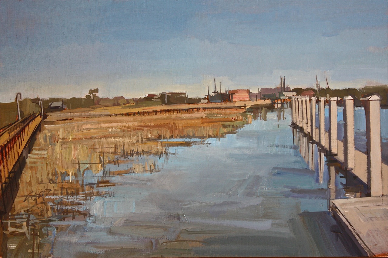
     The park consists of a series of boardwalks that zigzag back through the marsh and sea grass, with various shelters and connections to Shem Creek along the way as it empties into the harbor. Hovering over oyster beds and channels, the boardwalks penetrate this large expanse of space that would otherwise be off limits. Again, I was drawn to this idea of a man-made structure in contrast to the fluidity and changeability of Nature.

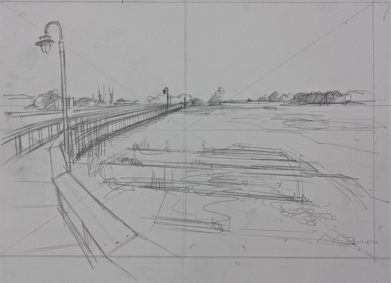
     Most of these paintings were preceded by pencil drawings in my sketchbook. I use these to determine the composition and how the space will function. Back in my studio, I can finalize the image and transfer it to a toned canvas. I'll re-draw with black paint and a liner brush, duplicating what was done with pencil and paper. Not only does this save me some time before I get on site, but it allows me to familiarize myself with the subject; drawing and re-drawing as a way of learning.

sketchbook drawing - 10" x 13.25"
oil on linen - 10" x 15"
      All of these are fairly small (10" x 15"), done in about 2 sessions on site. Usually if I put in 4-5 hours on site, I can wrap things up either from memory or the drawing. Because the tide becomes a factor, I had to do these on consecutive days, to ensure that the water and light levels remained fairly consistent.

sketch book drawing - 10" x 13.25"
oil on linen - 10" x 15"
      I did this whole series over a few months, with a big break over Christmas. I was amazed that when I resumed, there was this dramatic shift in the color of the sea grass. It had gone from green in the summer, to a golden orange in the fall, to a bleached out brown in the winter. I love getting to know a new area, with all the specific changes that occur throughout the seasons.

sketchbook drawing - 10" x 13.25"

oil on linen - 14" x 21"
     This last one (above), is the largest in the series, and was done over the longest period of time. The sea grass color had changed drastically over the month break. I took some photos to work on in my studio, because the weather had gotten colder and I wasn't able to work outside. I find it hard to switch back and forth between photos and painting from life. A photo is good to record the light, but the descrepency between the color of the photo and the color from life becomes a hinderance. For this one, it was probably equal parts site painting/drawing, photographic reference, and painting from memory. The last one in the series is still in progress, but I'm waiting for the weather to warm up in order to finish it:

(in progress) oil on linen - 12" x 18"