:

:
Showing posts with label Charleston. Show all posts

Friday, February 19, 2016

from the James Island Connector

     In the Fall of 2015, I worked on two separate commissions. The first will have to wait for another post, but this one was a landscape from the James Island Expressway, a high causeway which connects James Island to the peninsula of Charleston. The client had seen my work in Charleston before they moved to Utah, and wanted a painting of this view as a Christmas present for his wife. He contacted me around Thanksgiving, and since I had a lot going on at the time, I told him it wasn't possible to get the entire painting completed by then, but that I would do my best to get a few studies to him for approval by the holidays. He described the view that he wanted, which is a great panorama you see coming into downtown Charleston. The elevation is high (unusual for the Low country) and from there you can see the Charleston marina, various church steeples punctuating the skyline and the iconic Ravanel Bridge in the the distance. It's a similar view that I've wanted to paint for years, from another causeway bridge that I drive over almost every morning after dropping my kids off at school, so this seemed like a fortuitous opportunity.
     Since this spot is impossible to paint on site, I had to work exclusively from photo reference. Although I prefer to work from observation, in the end, I can work either way (and I'm usually the only one who can tell which are done from the motif and which are done from photos). It proved to be a difficult spot even to take the photos. I managed to convince my wife to pull over to the shoulder of the expressway one afternoon, with my whole family in tow, risking life and limb as I reached out the passenger side door as cars were zooming by at 40-50 MPH, to take about 2 dozen reference photos. I edited a few larger panoramas and from there the client and I agreed on the final scope of the scene and size (it was a longer format than I'm used to painting on, and I rounded the proportions off to a double square, 12" x 36")
     From the photos, I did this mock up drawing, trying to set up visual rhythms in the rectangle and adjusted certain elements so that they would line up with the rebatement of the square.
     After the drawing,  I transferred this to some paper, in order to do a color study. The thing that I dislike most about working from photographs is the amount of distortion that occurs in the color. Things usually tend to be 'bluer' and have more contrast then if observed with the eye, but I pulled out some other plein paintings that I had in the studio with a similar light (midday) and painted during the same season (late Fall). In the end, all paintings are fabricated 'lies' this way; an artist tweaks and distorts various elements of color, light and form to make a constructed, 'painted' reality.
     After the client approved both studies (he was a pleasure to work for, having no objections to what I proposed and sent along the way), I stretched the final canvas and began work. Because there was a lot of earth colors in the foreground and a large area of water, I decided to start off with a toned canvas rather than the white of the gesso. I usually do this by thinning a mixture of raw umber and burnt umber with turpentine, brushing it over the gessoed linen and then rubbing it off after about an hour. Once this dries, I start back in with a thin brush and black paint, drawing the linear elements and blocking in larger patches of color with a palette knife and wide brush.
     My biggest problem with studio paintings, especially ones done from photographic sources, is that the situation lacks the immediacy of working directly from the motif. Trying to capturing Nature's more fleeting elements (clouds, light and shadow, and the different subtlties of color) keeps me on my toes; without that, the brush work and paint handling can stiffen up and get contrived. I try to augment this tendency by sometimes working on the painting upside or without any reference in front of me, seeing the painting as an abstract organization of colored shapes and textures. Here are some of the progress shots along with details that I sent the client along the way:
     I usually frame my own paintings with a recessed dark shadow strip and oak edging. I can control the color of the shadow strip by actually using the same dark oil paint that is in the image, so there is a cohesiveness to the whole thing. Once the final was approved, I let it dry for a few weeks, framed it up, made a crate and shipped it out. Here's the completed painting with frame:

Wednesday, August 19, 2015

Fort Moultrie jetty


14" x 21"
15" x 23"
14" x 21"
     I started these 3 paintings in May, and worked on them most of the month, rotating through each one depending on the tide and weather. I was little more limited with the 2 paintings of the retaining wall, as the spot I was painting from was only accessible when the tide was out. It's a great spot to paint, a small cove at the tip of Sullivan's Island, with the famed Fort Moultrie a few hundred yards in. I had remembered the retaining wall, with it's large rocks and old pier stumps, as something that I wanted to paint; their muted earth tones creating interesting textures and shadow shapes.
     It was a challenge to paint these, as the tidal shift puts an extra element of pressure to capture the transient effects of nature on the scene. The sun became brutal by midday, bleaching out the colors on my palette and the surface of the painting. After each session, I had to tweak things in the studio a bit, reducing its whiteness and punching up the tones.
     These will be in a group show, "Passages" at Horton Hayes gallery this fall in Charleston. Besides referencing the way your eye takes you through different passages of paint across the canvas, this spot is also, literally, a passage for the ships that come in and out of Charleston harbor everyday. 

Tuesday, December 2, 2014

Some Figure drawings

     I've been teaching Drawing I for the past 3 years at the College of Charleston; 2 classes per semester, 2 days a week. It's been a good change for me, as I was in the decorative painting field as my 'day job' while I was in New York City. Teaching has given me the opportunity to organize my thoughts about Art (drawing) and pushed me out of my comfort zone, both by talking in front of groups of students, and also one on one. The politics of 'academia' and teacher compensation aside, I still believe that teaching is a valuable asset to my studio work and our community in general, and I keep doing it for the 3 or 4 stellar students each semester that I feel like I'm passing the torch to. I've had numerous teachers over the years that have made a big impact on me, both professionally and personally, from which to learn from.
     My favorite part of the semester is always when we get to draw from the model, which I usually save for the end. For a beginning class like this, I usually emphasis gesture and form, over anatomy and proportion. We do a lot of quick gesture drawing and short poses in order to have the students sync their eye-hand-mind together. I usually start with a demo, to try and walk them through how I would approach the drawing problem at hand. Here are a few recent ones, all vine charcoal on 18" x 24" paper:


Thursday, August 21, 2014

Night painting

     I've been working on this new night painting, on and off, since the spring. With the interiors, I'm able to work on a painting for a more sustained amount of time, due to the fact that the light and the forms don't change as much. Painting en plein air, you're mostly at the mercy of the weather and environment, for better or worse. Here, I'm able to take my time; pull out the painting a couple times a week and work at a more leisurely pace. Both have their advantages and disadvantages.
     My initial impulse and idea for the painting came after seeing the sun set through the trees in our backyard. Everyday, as the days move into the summer months, the light as it streams through our back porch and windows, is so beautiful and golden, it just calls out to be painted. Unfortunately, that time from 5-8pm is the worst time for me to set up in our living room to paint, so I altered it to a night painting with different kinds of artificial light.
pencil, 9" x 11"
     I started with this initial sketch in pencil, to figure out the main divisions of the composition. I wanted to get not only the porch, but the long hallway that leads back to my studio. I wanted this painting to contain a 'near' space, and a 'far' space. I was also intrigued by the idea of incorporating different light sources. The porch side having the darkness of night outside, with a soft glow overhead, and the deep space of my studio, far away, but brightly lit. I also put in the bright blue glow of the TV in between the 2 spaces, as an accent and counterpoint to all the orange wood tones. I just love painting all the patterns that our house has (courtesy of my wife), and the wood molding and floor create a warm, glowing atmosphere. Also, about half way through the painting, I realized that I could turn on the string lights outside the porch to create yet another light source and pattern. The dots of small lights lead you around the painting in arcs towards the center of the composition.
     One thing that doesn't come out in looking at art online is that the surface of the paint is not apparent. While I'm working, I'm continually conscious of how the paint is sitting on the surface...is it thin? thick? was this mark part of the underpainting? How does my eye move over the surface of the picture plane? Are there 'slips' that occur where my eye moves around the image. There's the image, the motif, and then there is the paint application. After each painting session, I tried to take a picture of each 'stage' of the painting. Please forgive the uneven quality of the photos (some were taken at night under artificial light, some during the day, and some with different cameras). Here is the progression of the painting:

 
finished painting; 22" x 27"

Tuesday, May 20, 2014

Charleston spots

This Spring, I've been doing a bunch of these small paintings of different spots in Charleston. The paintings are done on small wooden panels, with linen stretched over them. This is a new surface for me, as I usually like the slight 'bounce' that a stretched canvas brings, but I had all these extra wooden panels that I couldn't let go to waste. They are all 7.5" x 10", and they were all done in one shot, usually a 2 hour session. I usually make a few touch-ups, or re-work certain areas in the studio later, but for the most part, they are one session paintings. It took me awhile to adjust to such a small size, but I'm starting to like it now; it gives me no excuse not to finish the painting in one shot.


Friday, November 8, 2013

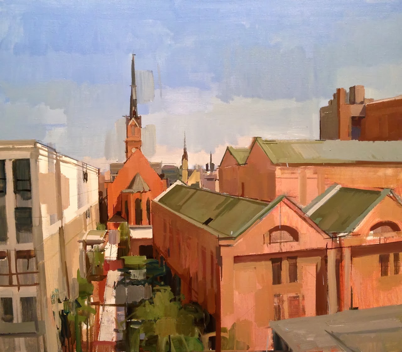
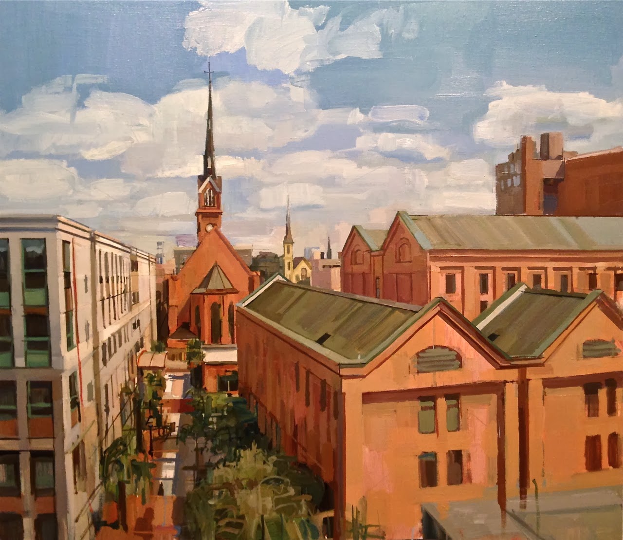
St. Philip Street progression

   I've pretty much reached the end of this painting. It's a fairly large painting (30" x 34.5") and I've been working on it regularly for about 2 months. An earlier post showed the prep work that went into it, but I've also documented the progression of the painting from start to finish. I've been doing this for a lot of paintings recently. Initially I thought it would just be fun to see, but for me it also provides a map of where I've been with the painting, and hopefully, where it is going. Each photo documents a painting session (give or take a few) which is usually about 3 hours. I did most of the work in the studio, but returned to the site to paint from the motif about 3 or 4 times. It's hard to do a painting this large on site... it takes a long time to set up, you're bound by weather conditions and the wind is always a disruption on rooftop paintings. At a certain point the light changes too much over the course of 2 months, so there's a lot on invention and relying on photos in the studio anyway. I think it's about as resolved as I can make it at this point, and I want to submit it for an exhibition soon. Here's the different stages with the final image when I stopped:

1st layer; washes of color over gesso. Used an actual size mock-up drawing to guide me
Thickening the layers of paint as I go; still fairly thin
Return to site, capturing the light and correcting the drawing
Adjusting the color in the studio. It's amazing the difference in color between outside and inside
Creating a surface density for the sky
Return to the site; working on the atmosphere from foreground to background
In the studio; blocking the cloud formations in from photographs
Back on site; clarifying things once more
Building the surface in the studio
Developing the clouds more; balancing 'looser' passages and 'tighter' passages
Final stage: noodling, straightening, balancing...the maddening part
   So at this point it's being put away. Sometimes when I put a painting away for awhile and bring it back out, what needs to be fixed will jump right out at me. There is a story I read about Claude Monet, who was known to want to go back into paintings after they were sold, sometimes many years later. Collectors didn't want him to view the work they had of his, because he would almost inevitably want the piece back so he could work on it more. I totally understand...a painting is never really 'finished', it is usually just stopped.

Wednesday, October 23, 2013

New Interior

   Here's an interior painting I'm working on right now. The idea came a few weeks ago while my daughter and I were watching a movie together, and as I came back into the room from the kitchen, the entire painting appeared to me in a flash. The motivation behind all my work is a desire to capture some sort of emotional response to the world; sometimes I have to dig for it and find it, but in this case, it hit me all at once. That's usually when I'm glad that my IPhone is in my pocket, so I can pull it out and take a quick shot to capture the moment. The next day I did a pencil sketch in the room and figured out the size of the canvas I wanted to use:

pencil on paper; 9" x 11"

   After toning the linen, I then proceeded to block the shapes in with a palette knife and large brush, striving for the overall light and mood of the painting:

oil on linen; 15" x 20"
   After a few sessions set up in front of the motif, the original vision for the painting began to emerge:


   I used the initial photo of my daughter as a reference for her portrait in the painting. I'm slowly starting to introduce the figure into my interiors, while still holding on to a sense of mystery and quietness in the work. Here's where it stands so far:

finished; 15" x 20"