:

:

Tuesday, July 24, 2012

The Gift

  
18.75" x 22.5"
     I've been working on a new painting over the past few weeks, another interior my house.  My initial idea for this painting came late one night as I was walking across the room depicted. Since I usually have my Iphone on me, I quickly snapped a picture. I've been doing this a lot lately, sometimes using the photo to mark a location outside or just capture an initial idea for a painting. In this instance, the whole painting appeared at once...one of those "this would make a great painting moment".  The light in the room was so mysterious and beautiful, with the deep recessed space through the pocket door and the cat peering in. Any painting with a cat in it usually reminds me of Balthus, which is always a good thing in my opinion. Right next to the open door, is our TV cabinet, which we use to "close off" the TV while we're not using it. Here I saw these 2 different opposing rectangular shapes: one hollow, and one full, one protruding and one receding. The 2 aqua vases act as a  nice accent amidst the sea of browns. Again, the heavy patterns became an emphasis in the room, both the ornate rug (which I painted before when it was in our bedroom in Brooklyn) and the different grains of the wood.
     In a lot of these recent interiors, either because they exist in the actual space or are projections of what I'm feeling, I'm painting spaces that are hidden or unknown; somewhat mysterious and 'heavy'...corners, hallways, stairs, dark shadowy spaces that are undefined, both literally and metaphorically. My family and I are anticipating the birth of another child (a boy) in few weeks, and for me, this painting captures some of the mystery and anticipation of this. I've told my wife that watching her go through pregnancy is like staring at a large gift box for 9 months and not being able to open it. While she's experiencing the changes in her body and the movements of the baby, I'm only able to observe, watch and wait...for the gift that is to come.
     Here's the sequence of the painting as it progressed along the way:


Tuesday, July 3, 2012

Downtown Charleston

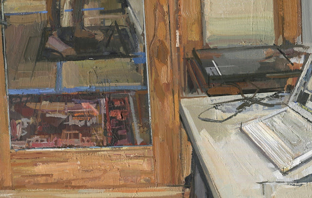
     Here's a few new ones that I've been working on, both done in downtown Charleston. The rooftop one I started a few months ago, and though I'm not sure if it is entirely finished, it's far enough along to photograph and view here. I like the format of it, the double square, and the complementary colors of red and green create a nice balance. I was attracted to the elevated vantage point and I'm thinking that I'll do a few more from this same location.

12" x 24"

     This second one was done on the harbor side, right next to the aquarium. My kids love the aquarium, so we go a lot...they have this great view looking north, with a few giant cranes used to lift the containers off the large ships after they pull into Charleston harbor. The spot reminded me of the cranes I used to paint in Red Hook, Brooklyn. While I was there, a few ladies stopped by, and while we were talking, they told me they were visiting from New York, and that their father used to work at the Navy Yard in Brooklyn in the 1940s and 50s. They thought my subject matter was interesting; I said I thought so too.

12" x 16"
      I painted this one fairly quickly, over 2 days, in about 5-6 hours. I started first with a drawing in my sketchbook, which I did to map out the composition. I usually like to work my paintings out by doing a drawing first, where I can determine the position of the different elements, as well as, the over-all scope of the scene. From there, I generally determine the canvas size and build and stretch one accordingly. I do, however, usually have a bunch of random sized canvases around my studio, to do 'quicker' paintings such as these. I try not to over-think these a much, and generally try to keep them loose and fresh...this one falls into the later category.
     It was blazing hot both days I painted, with the temps hovering around 100 degrees. Good for having the paint dry quickly but not so good for my stamina. I like the trio of primary colors (Red, Yellow, Blue) and the different structural and linear elements...I plan on doing a few more of these industrial based landscapes this summer.